
Colour, sheen and finish

Getting the balance right on classroom and nursery colour

Classrooms and nursery rooms sit somewhere between needing calm enough walls for children to concentrate and enough visual interest to feel welcoming rather than clinical. The right balance depends on age group, room use and how much colour the furnishings and displays already bring.

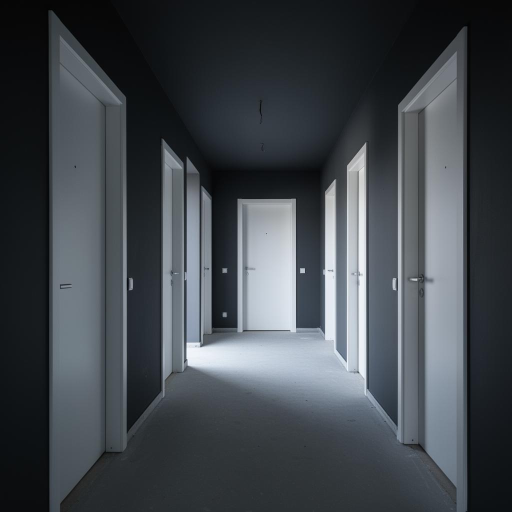
Nursery playroom painted in soft, coordinated colours around a reading corner

Calm base colours, considered accents

A calm, muted base colour across the main wall areas gives display boards, artwork and furniture room to provide the visual interest, rather than competing with a busy wall scheme. This tends to work better for concentration than saturated colour across every surface, particularly for older primary and secondary age groups.
Where nurseries can carry more colour than classrooms

Early years settings can generally carry more colour and playful contrast than a secondary school classroom, since the priority shifts towards a stimulating, engaging environment for very young children rather than sustained concentration on written work.

  • Nurseries can use brighter, more varied colour across play zones
  • Classrooms for older pupils generally benefit from a calmer base palette
  • Reading corners and quiet zones often work best in the calmest tones in the room

Durability in a room used by children all day

Whatever colour is chosen, a washable, robust finish matters enormously in these spaces, since walls take constant contact from bags, chairs, hands and cleaning routines. A beautiful colour in a finish that cannot be wiped clean becomes a maintenance problem within a term.

  • Specify a washable finish suited to daily contact and cleaning
  • Consider a hardier finish at dado height where furniture contacts the wall
  • Test colour and finish together, since sheen changes how bright a colour reads

How we work on this

  • We specify washable finishes suited to daily classroom and nursery use
  • We advise on calm base palettes that leave room for displays and artwork
  • We test colour and sheen together before recommending a scheme for a school

Questions we are asked about this

Should every classroom in a school be the same colour?

Not necessarily — a consistent family of tones across the school can work well, with small variations by year group or subject to help pupils orient themselves between rooms.

Is bright colour bad for concentration?

Very saturated colour across large wall areas can be overstimulating for some pupils, which is why many schools favour a calm base with colour introduced through smaller accents and displays instead.

What finish holds up best in a busy classroom?

A washable eggshell or similarly durable finish tends to withstand daily contact and cleaning far better than a flat matt, particularly at the height children and furniture actually touch the wall.

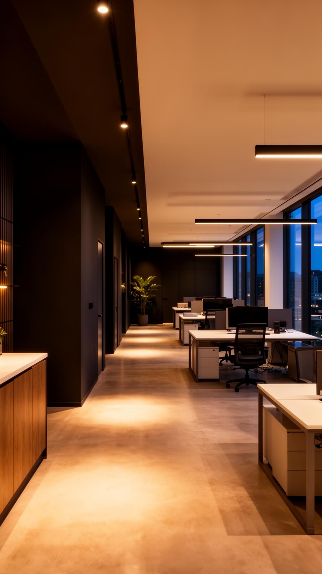
Primary school classroom with a calm base wall colour and a colourful display board

Tell us the age group and room use and we will suggest a colour and finish balance worth sampling.

Classroom and nursery colour should balance calm and stimulation by age group, backed by a genuinely washable finish.

Start your project

Planning a commercial painting or decorating project?

Speak to a Hampshire commercial decorating contractor that turns up, communicates clearly and delivers a finish that lasts.