
Colour, sheen and finish

Colour as a wayfinding tool in corridors and stairwells

Hotel corridor with a colour-coded accent band running along the skirting to indicate the floor

In buildings with repeating floors or long identical corridors, colour can do genuine navigational work, not just cosmetic work. A scheme that varies by floor or zone gives people a visual cue long before they read a sign, and it is worth planning that alongside the decoration rather than after it.

Colour coding by floor or zone

Assigning a distinct but coordinated colour to each floor or wing, applied consistently on doors, feature walls or skirting bands, gives occupants and visitors an immediate sense of location without relying purely on printed signage, which is particularly useful in care settings, schools and larger office buildings.

  • Consistent colour per floor helps orientation without extra signage
  • Colour bands on doors or skirting reinforce the coding at eye level
  • Coordinate the palette so zones feel related, not clashing
Where colour coding needs to work with existing signage

Wayfinding colour should support printed and tactile signage rather than compete with it or replace it. In buildings with statutory signage requirements, colour is an addition to way finding, never a substitute, and needs coordinating with whoever manages the signage scheme.

Practical durability in high-traffic wayfinding zones

Corridors carry more traffic than almost any other internal space, so a wayfinding colour scheme needs a durable, washable finish that will still look crisp after repeated contact from trolleys, wheelchairs and general foot traffic, otherwise the coding fades in usefulness long before it fades in colour.

  • Specify a washable, durable finish suited to the traffic level
  • Plan touch-up stock per colour zone for easy future maintenance
  • Check how the colour scheme reads under corridor lighting, often fluorescent or LED strip

Questions we are asked about this

Does colour coding actually help people navigate?

Yes, particularly in larger or repetitive buildings — a distinct colour per floor or zone gives a quick visual cue that people often register before reading a sign.

How many colours should a wayfinding scheme use?

Enough to distinguish each zone clearly without becoming visually chaotic — for most buildings that means a handful of coordinated tones rather than a different bright colour on every floor.

Can wayfinding colour be added to an existing decorating scheme?

Often yes, through accent bands, door colours or feature panels rather than a full repaint, which keeps disruption and cost proportionate to the benefit.

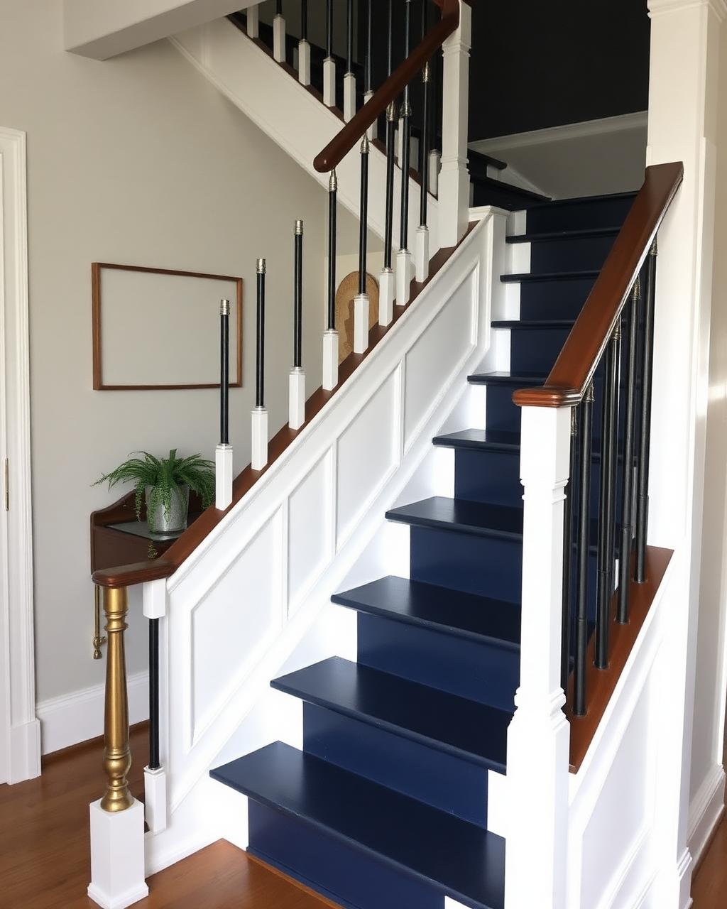
Stairwell landing painted in a distinct colour to differentiate it from the floor below

Share your building's floor plan and we will suggest a workable colour zoning scheme for wayfinding.

Colour can genuinely help people navigate a building when it is planned as a system, not applied as decoration alone.

Start your project

Planning a commercial painting or decorating project?

Speak to a Hampshire commercial decorating contractor that turns up, communicates clearly and delivers a finish that lasts.