
Colour, sheen and finish

Choosing a white for skirting, architrave and doors

Four white paint sample cards fanned against a pale grey wall

Nobody asks for a warm white or a cool white. They ask for white, and then find out there are dozens sitting behind that word. Trim white has to sit against a wall colour and a light source, so it is a relative decision, not an absolute one.

Undertone is the whole game

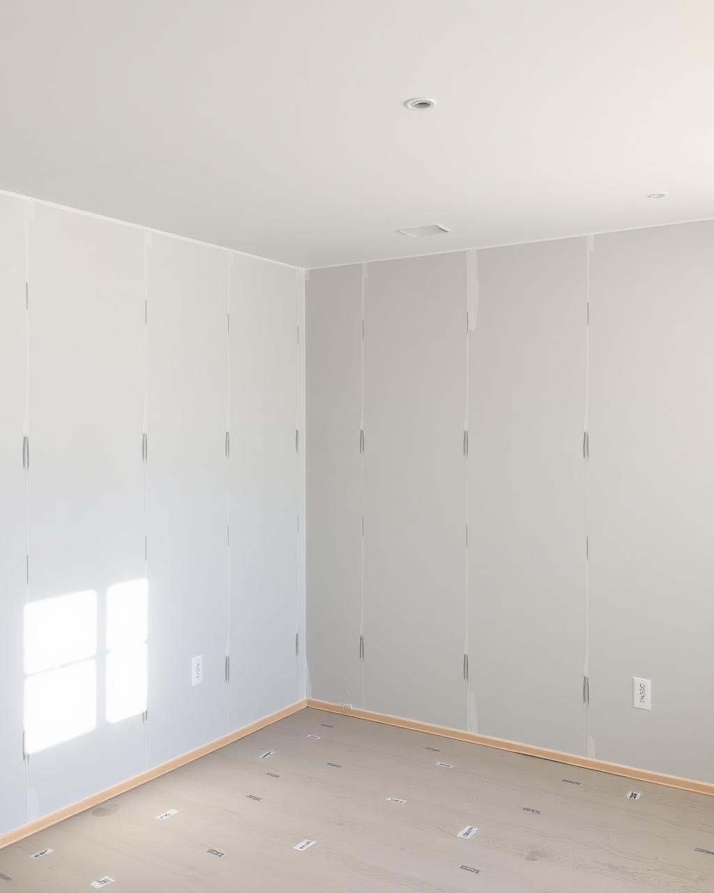
Every white leans slightly towards blue, green, yellow or pink once it is on a wall next to another colour. A crisp blue-white against a warm putty wall can look clinical, while a creamy white against a cool grey can look faintly dirty. The trim white needs to be chosen with the wall colour already decided, never before it.
Brilliant white is rarely the right white

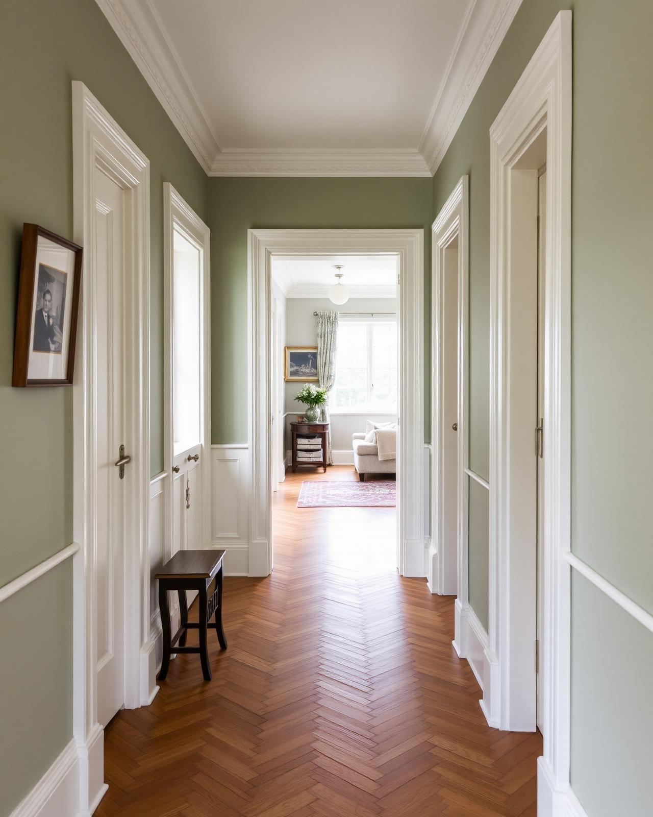
The brightest, most blue-leaning whites work in modern spaces with strong artificial light, but in older houses with warmer bulbs and less daylight they can look stark against period plaster and wood. A slightly warmer off-white often sits more comfortably with the rest of the house.

  • Check the white against the wall colour, not on its own
  • Test in the room at the time of day it is actually used
  • Consider the age and style of the joinery, not just the paint chart

Consistency across a whole house

Using one trim white throughout a house, even where wall colours change room to room, keeps the joinery reading as a single consistent thread rather than a patchwork. It also makes future touch-ups far simpler, because there is only one white to keep in stock rather than four close cousins.

  • One trim white simplifies future maintenance
  • Consistency reads as more considered from room to room
  • Reduces the risk of buying the wrong close-match white later

Questions we are asked about this

Should trim always be a different white to the ceiling?

Not always, but a slight step in sheen or a touch warmer or cooler often helps the eye separate the two planes, especially where cornice or coving meets a flat ceiling.

How many whites should I test before deciding?

Three is usually enough — a warm, a neutral and a cool option, painted onto card and moved around the actual room rather than judged on a small chip.

Does the sheen change how white looks?

Yes, a gloss white reflects more light and can look brighter and cooler than the same white in eggshell or matt, so sheen and undertone need testing together.

Freshly painted white skirting board meeting a warm-toned wall in a hallway

Tell us your wall colour and we will suggest two or three trim whites worth sampling.

There is no neutral white — the right one depends entirely on the wall colour and light it sits against.

Start your project

Planning a commercial painting or decorating project?

Speak to a Hampshire commercial decorating contractor that turns up, communicates clearly and delivers a finish that lasts.