
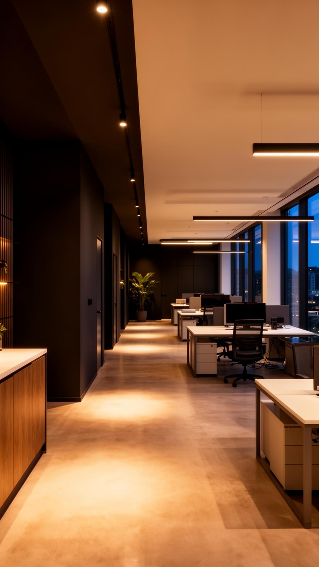
Colour, sheen and finish

Designing colour contrast with visual impairment in mind

Care home corridor with a door painted in a clearly contrasting tone against the surrounding wall

In care settings, sheltered housing and public buildings, colour is not only an aesthetic choice — tonal contrast between walls, doors, handrails and floors genuinely helps people with reduced vision move around safely. It is a consideration worth designing in from the start rather than adding as an afterthought.

Questions we are asked about this

How do you check if two colours contrast enough?

Viewing sample colours converted to greyscale, or using a simple light reflectance comparison, shows whether they will read as distinct tones rather than relying on hue alone.

Does this only apply to care homes?

No, it is relevant anywhere older people, visitors with visual impairment or the general public move through a building, including community halls, libraries and sheltered housing.

Can a contrast scheme still feel warm and homely?

Yes, contrast is about tonal difference, not about using stark or clinical colours, so warm tones at different depths can achieve the same practical result.

Why tone matters more than hue here

Two colours can look entirely different to someone with full colour vision yet read as almost identical in tonal value to someone with reduced or no colour perception. A door and its surrounding wall that share a similar tone, even in different hues, can effectively disappear against each other for some occupants.
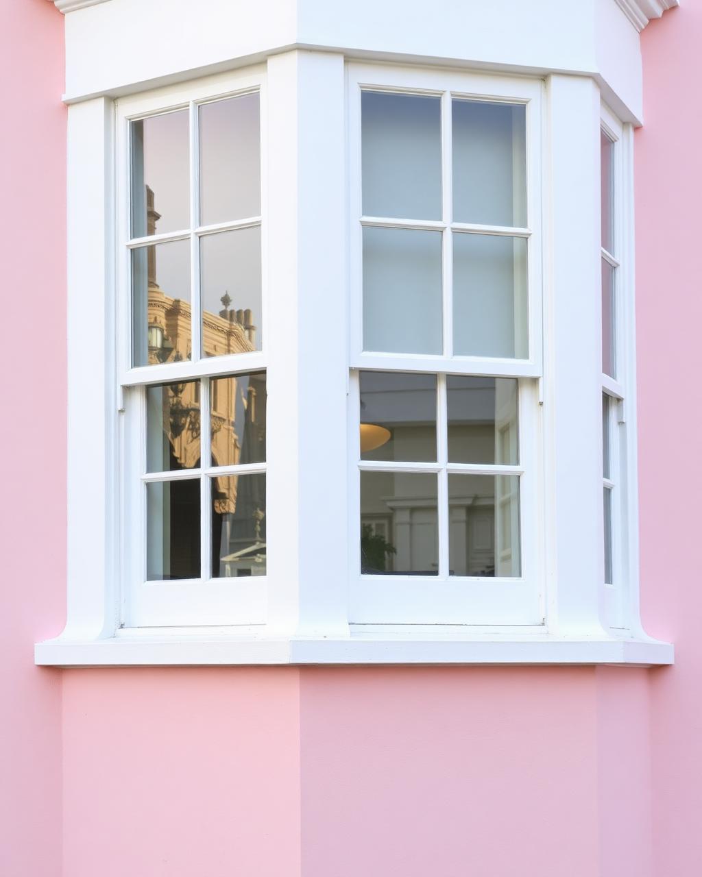
Handrail painted in a contrasting colour along a stairwell wall

Where contrast makes the most practical difference

Door frames against walls, handrails against their background, the top and bottom step of a staircase, and the edge of a floor change are the points where a lack of contrast most commonly causes hesitation or missteps, so these are worth prioritising over blanket colour changes elsewhere.

  • Doors and frames contrasted clearly against the surrounding wall
  • Handrails given a tone that stands out from the wall behind them
  • Step edges and floor level changes highlighted with a contrasting band

Keeping contrast schemes coordinated, not clinical

A contrast-led scheme does not need to look institutional. Warm, considered colour pairings can achieve the tonal separation needed while still feeling like a place someone wants to spend time in, which matters particularly in care homes and community buildings where people live day to day.

  • Test tonal contrast in greyscale, not just in colour, before deciding
  • Choose warm, coordinated pairings rather than stark clinical tones
  • Involve occupants or their representatives in reviewing sample areas

How we work on this

  • We check proposed colour pairings for tonal contrast, not just visual appeal
  • We prioritise contrast at doors, handrails and step edges as key decision points
  • We sample contrast schemes on site so occupants can see the real effect before full application

Tell us which areas of the building concern you most and we will propose a contrast-led colour scheme to sample.

Tonal contrast at doors, handrails and steps is a genuine safety consideration that a thoughtful colour scheme can build in.

Start your project

Planning a commercial painting or decorating project?

Speak to a Hampshire commercial decorating contractor that turns up, communicates clearly and delivers a finish that lasts.