
Colour psychology in workplace decorating
There's a lot of vague claims made about colour and mood. Stripped of the mystique, colour choice in a workplace has a small number of genuinely practical effects: how much light a room appears to hold, how large or small a space feels, how easy it is to concentrate, and how easily people find their way around a building. Those are the effects worth designing for.
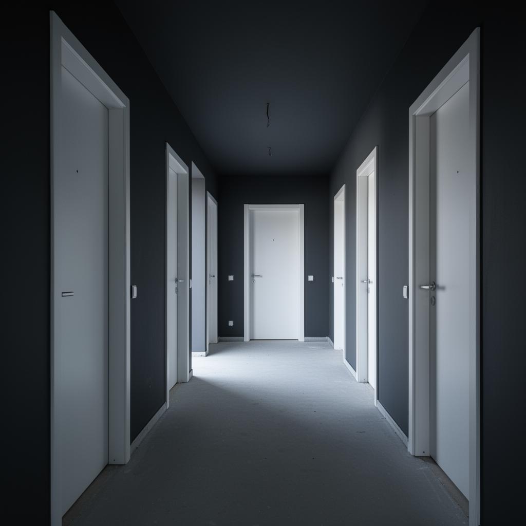
Light and perceived space
Pale, cool tones reflect more light and make a room feel larger and brighter, which matters in windowless offices, basement rooms and corridors with limited natural light. Darker tones absorb light and can make an already dim space feel smaller and heavier, so they work best where there's plenty of light to spare.
Contrast and visual noise
High-contrast schemes, strong colour against strong colour, read as busy and can be tiring in spaces where people work for long periods. Lower-contrast, tonally related colours give a calmer background that lets furniture, artwork or branding stand out instead of competing with the walls.
Focus versus stimulation
Muted, cooler tones in meeting rooms and quiet work areas support sustained concentration. Warmer or brighter accents in break rooms, reception areas or collaboration spaces signal a shift in purpose and can make those spaces feel more energetic without needing to repaint every wall.
- Meeting and focus rooms: muted blues, greens and neutrals
- Break and social areas: warmer tones or a bolder accent wall
- Reception: brand colour plus a calm supporting palette
- Classrooms: lower stimulation on wall colour, save contrast for displays
Wayfinding through colour
In larger buildings, schools and care settings, assigning a distinct colour or tonal family to each floor or wing genuinely helps people orient themselves, particularly visitors and anyone with reduced vision. This works best when it's consistent and simple, a handful of clearly different tones rather than a wide, similar-looking palette.
Care and education settings need a different approach
In care homes and schools, colour decisions carry more weight. High contrast between walls, doors and skirtings can help residents with dementia navigate independently. In classrooms, calmer wall colour reduces visual overstimulation while leaving room for the displays and materials that do the stimulating.
Avoid over-designing
Colour is one input among several, alongside lighting design, layout and signage. A scheme that leans entirely on colour to solve a wayfinding or mood problem will disappoint. We treat colour as a supporting measure, not a fix for a badly lit or poorly laid out space, and we say so plainly when a client asks colour to compensate for a structural or lighting issue that really needs addressing directly.
Testing before committing
As with any commercial scheme, the only reliable way to judge these effects is to sample colour on site under the actual lighting conditions, rather than relying on a swatch or a screen, which never represent scale or light accurately. We paint test patches at a reasonable size, view them at different times of day, and get sign-off from the people who will actually use the space, not just the person commissioning the work.
Colour and staff wellbeing over time
The effects of colour are subtle but cumulative, a workplace that feels calm and well lit day after day contributes to how staff feel about being there, even if no single colour choice is dramatic on its own. Consistency matters here more than novelty, a scheme that still reads as fresh and considered after a few years of daily use is worth more than a striking scheme that quickly feels dated or overbearing. We favour durable, tonally coherent palettes over trend-driven choices for exactly this reason.
- Favour tonally coherent palettes that age well over trend colours
- Keep high-stimulation colour to accents rather than full walls
- Review the scheme's condition periodically rather than waiting for full wear
- Match any touch-up work to the original spec rather than the nearest available tin
Working with existing furniture and materials
Most workplaces are not starting from a blank canvas, flooring, furniture and fixed joinery are usually already in place and represent a significant sunk cost that a new colour scheme has to work around rather than ignore. We take swatches or photographs of existing materials to site visits and build the palette to complement what's already committed, rather than proposing a scheme that looks good in isolation but clashes with the carpet, desks or reception furniture already installed.
Want a professional to handle it?
Need this done? Get a quote from Dynamic Decorating for commercial decorating.
Common questions
Does colour really affect productivity?
It affects comfort and perceived space more reliably than it affects measurable output, and those factors do influence how people feel about a workplace and how long they can comfortably work in it, which matters over the course of a full working day.
What colour makes a small office feel bigger?
Pale, cool, low-contrast tones with a matching or lighter ceiling generally read as more spacious than dark or high-contrast schemes.
Should every office use the same wall colour?
Not necessarily, varying tone by zone (focus rooms versus break areas) is often more useful than one colour throughout, since it signals a change in purpose and helps staff mentally shift between different types of activity.
Is colour psychology relevant for schools?
Yes, calmer wall colour in classrooms and clearer colour-coding between year group areas both have practical value.
Can colour help with dementia-friendly design?
Yes, strong tonal contrast between walls, doors and skirtings is a recognised practical aid to navigation in care settings.
Will you advise on colour as part of a repaint?
Yes, we discuss purpose and layout for each area before recommending a palette, not just a single colour for the whole building, and we sample on site before anything is finalised.
Related services
Covering Hampshire and the South Coast
Read next
Next step
Talk to us about a colour approach suited to how each part of your building is actually used.
Request a surveyPlanning a commercial painting or decorating project?
Speak to a Hampshire commercial decorating contractor that turns up, communicates clearly and delivers a finish that lasts.